

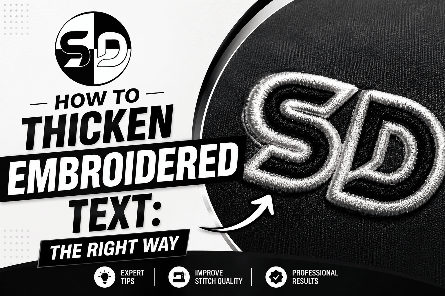

“Can You Beef Up the Words?”
Why Thickening Letters Isn’t Always the Best Fix in Embroidery
When reviewing a stitched logo, customers often say:
“Can you beef up the words?”
They usually mean the text looks too thin, weak, or not as bold as expected. While thickening letters can help in some cases, doing it the wrong way can cause embroidery problems instead of improving the result.
Why Embroidered Text Looks Too Thin
Text that appears thin or weak after stitching is usually caused by:
Incorrect stitch type for lettering
Low stitch density
No pull compensation
Artwork that was not designed for embroidery
Small or narrow fonts that work in print often do not translate well to thread.

Does Increasing Stitch Width Fix the Problem?
Simply increasing stitch width or density can create new issues, such as:
Letters merging together
Thread breaks
Loss of clean edges
Bulky or stiff embroidery
“Beefing up” text without adjusting the stitch structure is like adding more paint without fixing the brush.
The Right Way to Strengthen Embroidered Words
A professional embroidery digitizer improves lettering by:
Selecting the correct stitch type (satin, run, or fill)
Adjusting pull compensation for cleaner edges
Simplifying or modifying fonts for embroidery
Controlling density for smooth coverage
Sometimes, the best solution is font substitution or slight redesign, not just thickening strokes.

Why Font Choice Matters in Embroidery
Not all fonts are embroidery-friendly. Thin scripts, sharp serifs, and condensed fonts often cause:
Broken letters
Poor readability
Inconsistent stitch quality
Professional digitizing ensures text remains clear, bold, and readable, even at smaller sizes.
What Customers Should Know Before “Beefing Up” Text
Before increasing thickness, consider:
Final logo size
Fabric type
Stitch direction and flow
Machine limitations
Text that looks bold on screen may already be at the maximum safe thickness for stitching.

Final Thoughts
“Beefing up the words” is sometimes necessary, but it must be done strategically, not by simply adding stitches. Proper digitizing adjustments ensure lettering stays bold without compromising quality.
Need Help Improving Embroidered Text?
If your logo text looks too thin or unclear, professional embroidery digitizing can make it strong, readable, and production-ready. SASSY DIGITIZING specializes in optimizing lettering for clean and consistent embroidery results.
hi
faaaaaaaaaaaaaaa